Melanoma Font
Melanoma New Zealand
Overview
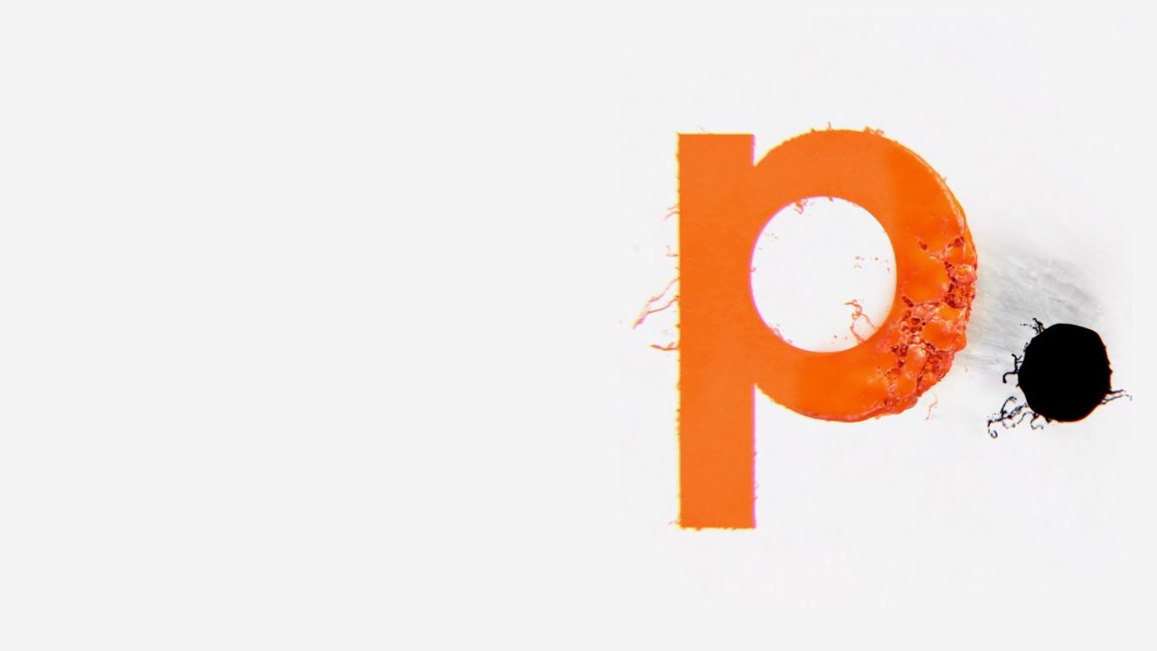
To demonstrate to New Zealanders that dangerous skin cancers could be hiding in plain sight, we created a typeface designed to teach people to take a second look at spots on their skin.
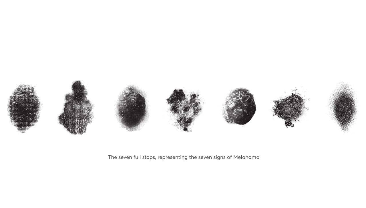
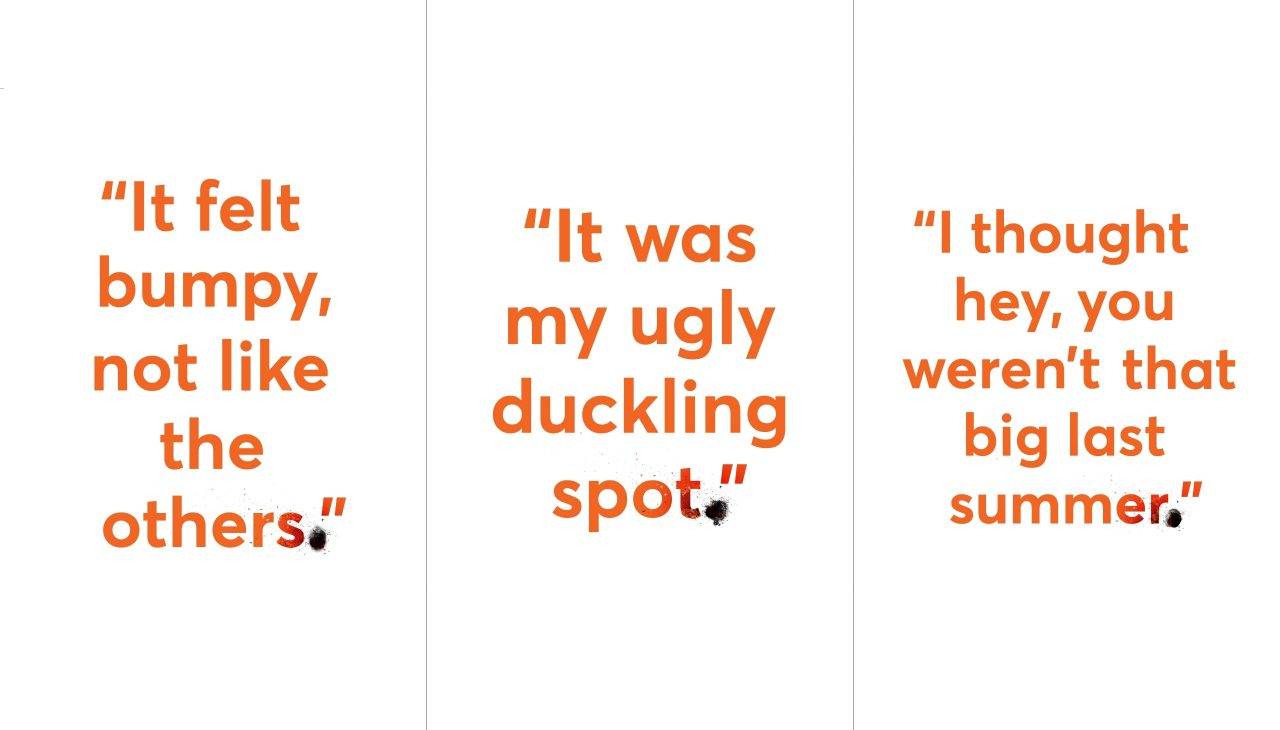
The typeface was a single full-stop, with seven weights, designed to accurately depict the symptoms of melanoma. We partnered with some of New Zealand’s most loved brands and hid our full-stop within their advertising.
We then revealed this to Kiwis through an integrated PR and advertising campaign under the banner “don’t let your spot turn into a full-stop”, earning mass media coverage for the cause.
Channels
OOH, Digital
Awards
Cannes Lions
Non-Profit/Foundation Education and Awareness – Bronze
